Why “Us Against the Machines?”

Besides the header image on this site, nothing so far explains its URL, “usagainstthemachines”. It’s kind of catchy, probably because of the popular 90’s rockband band “Rage Against the Machine”. One friend said it reminded her of John Henry’s battle against the steam engine. I’ve been using this phrase for years while working with people to come up with technological solutions for problems. Whenever there is some difficulty along the way I’ll say it and it always makes people laugh and creates a sense of comradery — that’s why I chose it.

Someone called the phrase “playfully antagonistic,” and indeed the against is not seriously meant to promote a battle. Cultural anthropologist Michael Wesch at Kansas State University made this cool and informative video titled “The Machine is Us/ing Us” in 2007, maybe this helps clarify from what perspective I see this “against” thing.

How we treat identity online is indeed a question, for who is us? So it’s not like I have answers to these questions but I do find it fascinating to think about them. As you can see from some of my projects and references, I love using machines.

Posted in Uncategorized | Comments closed

Network Visualization

LinkedIn

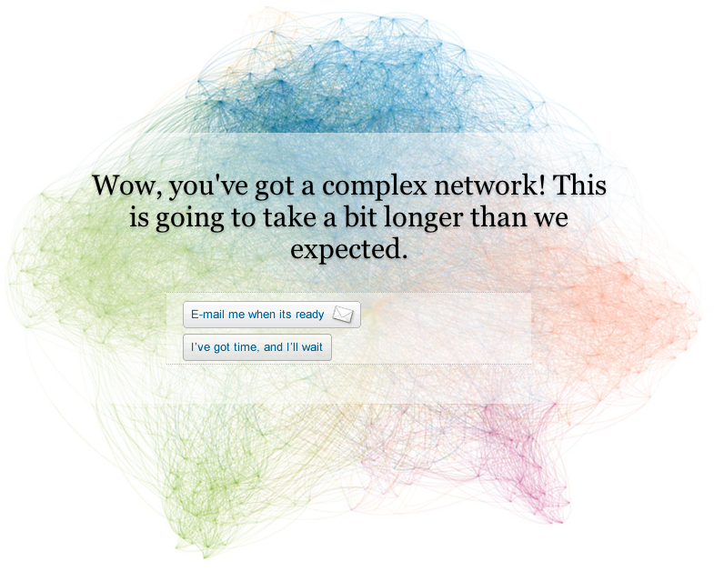
On Monday, LinkedIn announced a network visualization service called Inmaps. As a true network visualization junky I of course immediately had to give it a whirl to see how my 230 connections are connected. Either the servers are flooded with requests or my network is too complicated to easily compute — no results so far…it’s been 10 hours and I haven’t received an e-mail yet!

Another thing that happened in network visualization land is this full-text visualization of the Wikileaks Iraq War Logs by Jonathan Stray and Julian Burgess. Each document is a node, and edges between them are weighted using cosine-similarity on TF-IDF vectors from the free text summary of “significant action” reports from December 2006. They used Gephi, a free graph visualization tool with a Fruchterman-Reingold force-directed layout.

Stray is working on a Knight News Challenge grant to build an open-source system for journalistic visualization of very large document sets.Cool!

There is some interesting clustering but, as usual, it is difficult to really make sense of these “hairballs.” This reminded me of what was discussed at the “Connecting the Dots” symposium (<–click on talk titles for prez docs) held at Harvard last fall. Ben Frye in particular underlined the “angry fruit salad” visual assault effect of these visualizations, as they look really cool but the network will look different depending on the layout algorithm used and when many edges cross there is only so much sense you can make of the data. If you share my network analysis and visualization obsession you might want to check out some of the links in the reference section on this site.

From Stray’s blog: “This is a picture of the 11,616 SIGACT (“significant action”) reports from December 2006, the bloodiest month of the war. Each report is a dot. Each dot is labelled by the three most “characteristic” words in that report. Documents that are “similar” have edges drawn between them.”

Posted in Uncategorized | Tagged , , | Comments closed

Hello world!

Hurray! Another WordPress site is born!*

This will be a place to gather and share some of the stuff I’ve been thinking about and working on for the last few years.

*Shoutout to Glenny@ Smith and Vine for drawing such a sweet header. As I’m figuring out the human-machine dynamic I’m curious how/if/when this graphic will evolve ;-P

Posted in Blog, Uncategorized | Comments closed