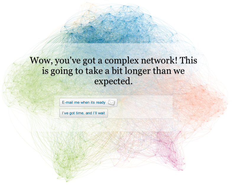
On Monday, LinkedIn announced a network visualization service called Inmaps. As a true network visualization junky I of course immediately had to give it a whirl to see how my 230 connections are connected. Either the servers are flooded with requests or my network is too complicated to easily compute — no results so far…it’s been 10 hours and I haven’t received an e-mail yet!
Another thing that happened in network visualization land is this full-text visualization of the Wikileaks Iraq War Logs by Jonathan Stray and Julian Burgess. Each document is a node, and edges between them are weighted using cosine-similarity on TF-IDF vectors from the free text summary of “significant action” reports from December 2006. They used Gephi, a free graph visualization tool with a Fruchterman-Reingold force-directed layout.
Stray is working on a Knight News Challenge grant to build an open-source system for journalistic visualization of very large document sets.Cool!
There is some interesting clustering but, as usual, it is difficult to really make sense of these “hairballs.” This reminded me of what was discussed at the “Connecting the Dots” symposium (<–click on talk titles for prez docs) held at Harvard last fall. Ben Frye in particular underlined the “angry fruit salad” visual assault effect of these visualizations, as they look really cool but the network will look different depending on the layout algorithm used and when many edges cross there is only so much sense you can make of the data. If you share my network analysis and visualization obsession you might want to check out some of the links in the reference section on this site.
From Stray’s blog: “This is a picture of the 11,616 SIGACT (“significant action”) reports from December 2006, the bloodiest month of the war. Each report is a dot. Each dot is labelled by the three most “characteristic” words in that report. Documents that are “similar” have edges drawn between them.”

